Designing for Conversions within Email Marketing
Ever wondered why some emails drive more sales than others, even when they look equally appealing? In this episode, our experts uncover the secrets behind designing emails that truly convert.
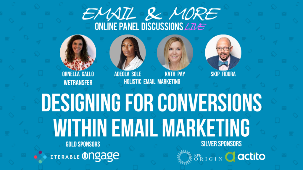
In this episode of Email & More, moderator Skip Fidura, was joined by Ornella Gallo, Adeola Sole, and Kath Pay. They discussed how to design emails that not only look good but also drive conversions, which is the ultimate goal for any email marketer. Diving into the difference between designing for aesthetics and designing for conversions, optimising existing templates, and the importance of understanding your audience’s needs and behaviours.
Key Highlights and Quotes
Ornella Gallo, Senior Email Marketing Manager at WeTransfer, shared her challenges and strategies in balancing aesthetic design with functional email marketing.
“Content must be specific for the email. Short, sweet, and interesting, with a clear purpose. This leads to better engagement and conversion.” – Ornella Gallo
Adeola Sole emphasized the importance of designing with the user in mind, rather than purely for aesthetics.
“Designing for aesthetics is more personal and often disregards the user experience. Designing for conversions requires a strategic approach to optimize user experience and achieve desired outcomes.” – Adeola Sole
Kath Pay, a bestselling author and award-winning thought leader, discussed the significance of understanding the technical limitations and user intent in email design.
“When designing for email, you must consider the coding limitations and the user’s journey. Sometimes a simple text email can be more effective than a visually stunning one.” – Kath Pay
Understanding Email Design for Conversions
Designing for conversions goes beyond creating visually appealing emails. It involves a strategic approach that considers the user’s journey, behavior, and needs. Amir and Kath discussed several crucial aspects, including:
Aesthetics vs. Functionality: While aesthetic design is important, it should not overshadow the primary goal of driving conversions. The design should facilitate easy navigation and clear calls to action.
“The form of an email should follow its function. Beautiful design is valuable, but it must not compromise the email’s ability to convert.” – Kath Pay
Personalization and Relevance: Sending personalized content that resonates with the recipient’s needs and interests can significantly boost engagement and conversions.
“Personalized, dynamic content that speaks directly to the recipient can drive higher engagement and conversion rates.” – Ornella Gallo
Common Myths and Realities
One common myth is that a visually stunning email design will always result in better conversions. However, as discussed, the design must serve the email’s primary function and align with the recipient’s intent.
“A beautiful email that doesn’t drive action is a missed opportunity. Design should enhance the email’s purpose, not just its appearance.” – Adeola Sole
Practical Tips for Optimising Email Design
- Keep it Simple: Avoid overly complex designs that can confuse the recipient. A clear, simple layout with a strong call to action is often more effective.
“Less is more. A simple, clean design with a clear message is more likely to convert than a cluttered, complex one.” – Kath Pay
- Test and Iterate: Continuously test different design elements and layouts to see what resonates best with your audience. Use data to inform your design decisions.
“Testing is crucial. It allows you to understand what works best for your audience and refine your approach accordingly.” – Ornella Gallo
- Focus on Mobile: Ensure your emails are mobile-friendly. Many users read emails on their mobile devices, so a responsive design is essential.
“Mobile optimization is not optional. Your emails must be easy to read and interact with on mobile devices.” – Adeola Sole
- Use Engaging Visuals: While keeping the design simple, use engaging visuals like GIFs to capture attention and drive action.
“GIFs can add a dynamic element to your emails, making them more engaging and interactive.” – Ornella Gallo
Designing for conversions in email marketing is a multifaceted challenge that requires a holistic approach. By understanding and implementing best practices, marketers can create emails that are not only visually appealing but also highly effective in driving conversions.
Many thanks to our special guests Ornella Gallo, Adeola Sole, and Kath Pay for joining our panel and lending their expertise, as well as to our live audience for their valued participation and questions.
Finally, a big thanks to our sponsors Iterable, Ongage, RPE Origin, and Actito for their generous support of this series.
Hungry for more? Email & More will be back to talk The Ins & Outs of Email Deliverability on 23 August 2022. Sign up to receive our newsletter, Holistic Insights or follow us on social media to stay informed!


