How to create an effective apology email: 7 examples
Need to send an “Oops!” email? It’s crucial to follow up your error with the right message. Learn from these examples.
Breathes there the email marketer who never had to send an “Oops!” email?
So you say your marketing team never had to send an “Oops!” email? Don’t be too smug. Maybe your turn just hasn’t come yet.
Conventional email wisdom says every marketer will have a medium-to-epic fail sometimes. A campaign goes out with broken links or images, the wrong offer or an expired code. Or you send it to the wrong segment or the wrong list, such as your global suppression list.
Sometimes an entire automated program can fail. My MarTech colleague Ryan Phelan revealed what happens when abandoned-browse emails go rogue in 3 ways to avoid email automation breakdowns.
I don’t believe errors are inevitable, but that’s a topic for another post. What’s more important is following up that error with the right message.
Why you need an apology email strategy
A good apology email can maintain customer trust in your brand and bring them back to convert. A bad one can cost you a customer — or many, depending on how significant the error is.
7 characteristics of an effective apology email
A good apology email has these characteristics:
- Goes out ASAP after you discover the error.
- Apologizes for the mistake.
- Explains clearly and succinctly what went wrong.
- Corrects the error and offers reassurances if needed.
- Uses your brand’s email template, up-to-date branding elements and a copy style that matches your brand voice and character.
- Gives customers a reason to click no matter what the original error was.
- Acknowledges the error in the subject line so customers understand what happened.
If the error is serious enough, you might need to include a customer-service contact.
A few words about subject lines
Let’s eliminate “Oops!” “Oops!” looks friendly and unthreatening and implies the damage from the earlier campaign wasn’t that bad. But “Oops” won’t mollify customers who clicked into a 404 page, discovered at checkout that your promo code didn’t work or previously unsubscribed from your email program.
Plus, as you’ll see below in my list of email examples, you don’t need it if you have the right subject line.
Another thought: Many apology emails in my collection mention the error only in the subject line and then run the email as is. This minimal approach can look a little sketchy, especially if you don’t explain what the problem was, how you fixed it and what customers can expect.
Trust can be lost as you might end up looking as if you’re just faking the injury, which customers don’t like. Transparency is key.
You need not create a whole new email (see the Mud Pie example below to discover how a simple copy tweak here and there might suffice). But if the original email goes out unchanged, it can look as if you’re just trying to push another campaign through.
7 apology emails to emulate
Like most email marketers, I have a personal swipe file of brand emails, including a collection of apology emails that run the gamut from cringe-inducing to impressive. I didn’t have to look too far to find examples worth sharing.
For each email example, I’ll explain what it gets right and what else it could have done to add value or persuade customers to click or click again.
1. Vision Direct UK
- Subject line: Oops! We’re turtle-y sorry
- Preheader: FREE LED Mirror is ready – grab yours now.
- Email URL
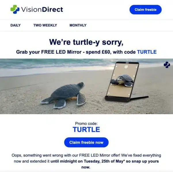
What’s good: This is one of my favorite apology emails. It hits all the right notes:
- The subject line has a clever pun, repeated in the message header, that acknowledges the failure and apologizes.
- It explains why customers couldn’t use the previous promo code without going into needless detail.
- It extends the offer deadline as a make-good.
- The apology copy runs under the call to action so customers can’t miss it.
- It adds another CTA button at the top for customers who don’t care about the apology.
- Who can resist a turtle admiring itself in the mirror that the email promotes? So it’s turtle-y — I mean, totally — relevant.
What else could it do? The “Oops.” With that clever subject line, you don’t need it.
2. Mudpie
- Subject line: 🎅 Oops, we forgot to check our list twice…
- Preheader: 3 months until Christmas, are you ready?
- Email URL

What’s good: We can imagine the panic that Mud Pie’s email team must have felt when someone pointed out that they launched their holiday email campaigns a month early. But the team recovered quickly by correcting the copy and adding a brief but empathy-seeking explanation to the top image. A few things to highlight:
- The email launched around 9 a.m. ET and the apology email went out later that day.
- It added a brief but brand-appropriate copy explaining the error to the original template. This gave customers who might have missed the original email plenty of things to click on, including the time-saving checklist.
What to work on: Was the Christmas Shop ready for customers? Or did the links crash or drop the customers off at Mud Pie’s homepage? The apology doesn’t make that clear. So I couldn’t help wondering if it was real or a publicity stunt.
Plus, “Oops” again. Not needed given the subject line.
3. Ace Hotel
- Subject line: Oops! A code that works.
- Email URL
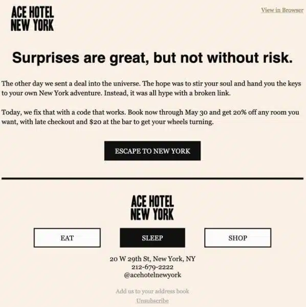
What’s good: Sometimes short and sweet is the way to go for an apology email, and it works here for Ace Hotel New York, a trend-setting hotel in midtown Manhattan.
- It uses some plain but elegant language to explain what went wrong.
- It restates the offer to remind customers what they’ll get and then goes right to the call to action.
What to work on: “Oops.” Still not needed with this subject line.
4. Just Eat
- Subject line: Oops, we sent you the wrong offer
- Email URL
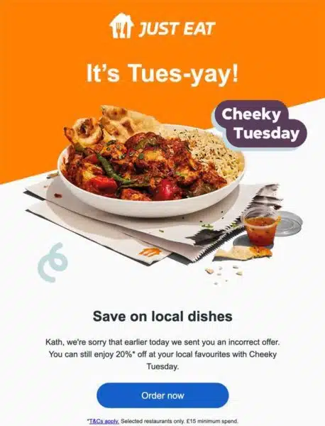
What’s good: This brand wins for a quick turnaround. Its apology email arrived in time for customers to be able to use the Tuesday-oriented promo. It also apologizes for the earlier email, which might not have worked for customers trying to claim it.
What to work on: Instead of stating the obvious (“Oops”), I’ll give you another reason not to use it. Sometimes “oops” comes out as “opps.” If you are under pressure to launch your make-good email, a typo like that could slip through, and it just would look sloppy.
5. Thinkific
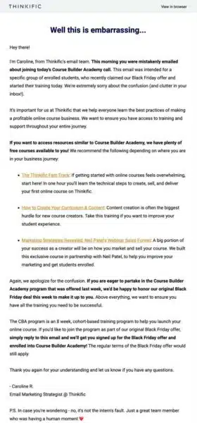
- Subject line: Oops: This is embarrassing…
- Email URL
What’s good: Yes, this is a lot to read. Given that an email intended for a specific audience went out to the list at large, and people might have freaked out over the potential cost, you might need that extra effort to rebuild trust and protect your brand’s authority.
- This email comes from a person, not just a brand. As a fellow email marketer, I applaud her bravery! This way the email reads more like a personal letter.
- She explains what went wrong — it appears to be a segmentation snafu.
- The make-good offer is clear: the same discount as the targeted segment
- She restates the company and course values.
- Directions are clear about how to redeem the offer because it has no CTA button.
What to work on: Besides dropping the “Oops,” the email comes close to resembling a last-minute pitch to nonresponders from the previous campaign. Maybe a little less content about the courses?
6. Secret Escapes
- Subject line: Oops, that last email might have been hard to read
- Email URL
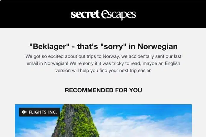
What’s good: This travel brand sent its original campaign out with a subject line, preheader and intro copy in Norwegian and then followed up with this apology.
- The apology acknowledges that non-Norwegian recipients might have been baffled by what was written. I liked that they used (and translated) a Norwegian phrase to apologize. Language aficionados might even have appreciated the Norwegian mini-lesson.
- Secret Escapes emails use a combination of business objectives and personalization using AI. As I have lived in the UK, it’s not unusual that the copy in this personalized email would promote mainly UK holidays. So, seeing the intro copy written in Norwegian was certainly not standard for me :-). But it’s a good reminder that mistakes can happen even in an advanced email program.
What to work on: A little typo in the apology copy distracted me a bit from the otherwise well-written copy. No matter how pushed your team is to get the apology email out, always proofread and check links. Plus, “Oops.” Still not needed.
Dig deeper: How bad data can spoil good personalization
7. Marine Layer
- Subject line: Oops… let the games start.
- Preheader: We caught a little heat.
- Email URL
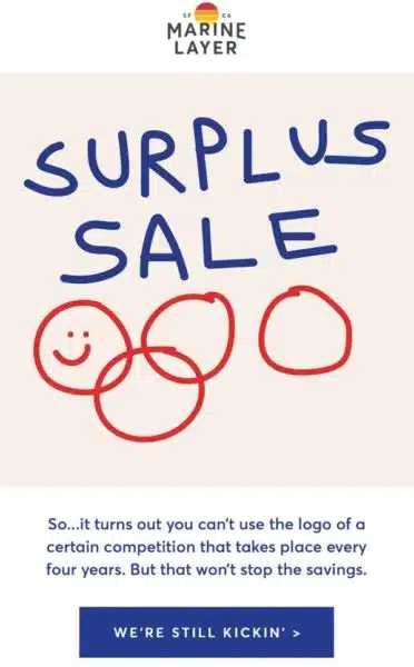
What’s good: Could this be one of the best apology emails ever sent by an ecommerce company?
- It’s funny. Marine Layer’s email team totally owns up to their error and both corrects it and pokes fun at the hypervigilant Olympics brand protectors.
- Love the artwork! It probably took somebody a minute, if that, to scribble this, but it captures the mood and tweaks the classic Olympics logo at the same time.
- The CTA copy works, too. Technically, this message isn’t so much an apology email as a “please don’t sue us for copyright infringement” email. But cheers for keeping the chuckles going all the way through the email.
What to work on: Look at the subject line. What am I thinking here?
One final thought: Test to discover which format works for you
Each apology email in my list takes a different approach. I hope you found a couple that could inspire you to update yours. But before you copy a design into your own template, ask yourself:
- Does it fit with your brand?
- Is it appropriate?
- Does it give customers a reason to click and to keep trusting your brand?
- Could you put it together quickly in a crisis? Or would you have to lean on your email developer for a fast turnaround?
Testing an apology email seems a little bizarre. How can you test for something you can’t anticipate? Consider creating a standby apology template to act as your control and then create a variation of it when you have to send an apology email to learn what prompts more action — not just opens but clicks and conversions, too.
Divide your distribution list in half. Send your control to one segment and your variable to the other, then compare the results. What you learn could help you the next time (if there is one!) you have to apologize for an email gone wrong.


